完成CSS圆环的5种办法(小结)
时间:2024/10/18作者:未知来源:手揣网教程人气:
- [摘要]这篇文章主要介绍了实现CSS圆环的5种方法(小结),有一定的参考价值,有需要的朋友可以参考一下,希望对你们有所帮助。想到去年面试实习的时候被问到实习圆环的问题,特意写篇文章总结一下吧!总结了一下大概...这篇文章主要介绍了实现CSS圆环的5种方法(小结),有一定的参考价值,有需要的朋友可以参考一下,希望对你们有所帮助。
想到去年面试实习的时候被问到实习圆环的问题,特意写篇文章总结一下吧!总结了一下大概有5种方法。
1. 两个标签的嵌套:
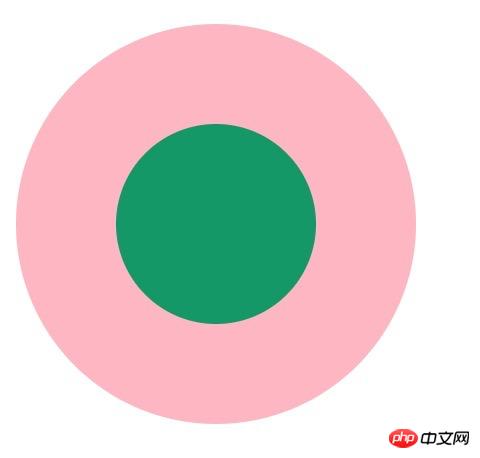
<p class="element1">
    <p class="child1"></p>
</p>
.element1{ width: 200px; height: 200px; background-color: lightpink; border-radius: 50%; } .child1{ width: 100px; height: 100px; border-radius: 50%; background-color: #009966; position: relative; top: 50px; left: 50px; }2. 使用伪元素,before/after
<p class="element2"></p>
.element2{ width: 200px; height: 200px; background-color: lightpink; border-radius: 50%; } .element2:after{ content: ""; display: block; width: 100px; height: 100px; border-radius: 50%; background-color: #009966; position: relative; top: 50px; left: 50px; }3. 使用border:
<p class="element3"></p>
.element3{ width: 100px; height: 100px; background-color: #009966; border-radius: 50%; border: 50px solid lightpink ; }4. 使用border-shadow
<p class="element4"></p>
.element4{ width: 100px; height: 100px; background-color: #009966; border-radius: 50%; box-shadow: 0 0 0 50px lightpink ; margin: auto; }<p class="element5">
.element5{ width: 200px; height: 200px; background-color: #009966; border-radius: 50%; box-shadow: 0 0 0 50px lightpink inset; margin: auto; }5. 使用radial-gradient
<p class="element6"></p>
.element6{ width: 200px; height: 200px; border-radius: 50%; background: -webkit-radial-gradient( circle closest-side,#009966 50%,lightpink 50%); }如果大家有其他的方法,请告诉我吧,谢谢!!!
总结:以上就是本篇文的全部内容,希望能对大家的学习有所帮助。更多相关教程请访问 CSS视频教程!
相关推荐:
php公益培训视频教程
CSS在线手册
div/css图文教程
以上就是实现CSS圆环的5种方法(小结)的详细内容,更多请关注php中文网其它相关文章!
网站建设是一个广义的术语,涵盖了许多不同的技能和学科中所使用的生产和维护的网站。
关键词:完成CSS圆环的5种办法(小结)